


 MENU
MENUWhen working with large quantities of data, efficiency is crucial. It’s essential to have tools that effortlessly cut through and visualize mountains of data to discover meaningful information. For decades, Tecplot 360 has been a leading post-processor used to analyze results in 3D, 2D data, and line data, but did you know that in combination with open-source tools, you can customize its capabilities?
We recently customized 360 by coupling it with PyQt to dynamically manage huge amounts of line plots! Tecplot 360 has powerful line plotting capabilities with a graphical user interface (GUI) geared for creating generic line plots one by one, but the GUI isn’t made to manipulate sizeable quantities of line plots all at once.
In this blog post, we’ll reveal how the Tecplot team used a Python module called PyQt with PyTecplot and open-source color palettes to create a customizable GUI to speed-up the creation and manipulation of line plots in Tecplot 360. Combining PyQT with PyTecplot reduced the plotting process from minutes to seconds.
The Test: Lots and Lots of Linemaps
Where did we find all of this line data? The High Lift Prediction Workshop (HLPW) releases a high quantity of line data results with the intent of improving computational capabilities for high-lift aerodynamic flows. Some of these line plots contain tens of line maps. For example, the plot below contains more than 30 different lines each representing separate simulation data:
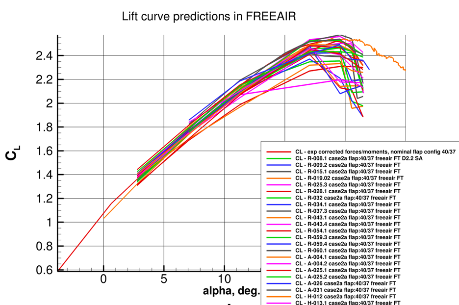
Starting with this plot, let’s say we want to study the Mesh Adaption simulation line data results (the line maps starting with CL- A*). It will take a significant number of clicks to turn off the other line maps and recolor each Mesh Adaption line map. If we want to plot only the Fixed Grid RANS simulation data (CL- R*) after that, it will take additional clicks to create and recolor only these linemaps. What’s the solution to speed up this process?
Solution: PyTecplot and PyQT GUI
To manage large quantities of line plots with speed and ease, the Tecplot team developed a PyTecplot script that takes advantage of an open-source module called PyQT to create a custom graphical user interface (GUI) to manage this line data:
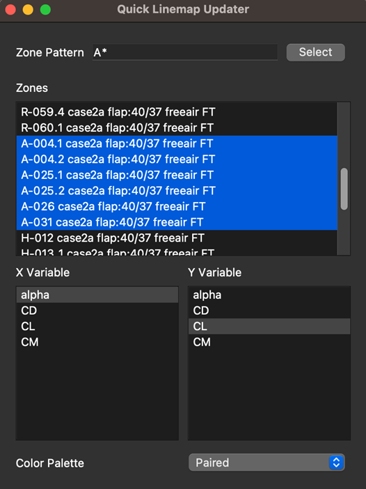
In the custom PyTecplot GUI above, you can select the zones defining the linemaps by clicking and dragging over multiple zones or by using pattern matching in the Zone Pattern field. Below the Zones field, the line plot X-axis variable can be defined, and the Y-axis variable can be defined. These variable fields allow users to update the axis variables for as many zones as desired with a single click.
Since color plays a critical role in communicating information, the team also added a feature at the bottom of the GUI which differentiates selected line maps by integrating color palettes from ColorBrewer 2.0. The PyTecplot script uses these color palettes to rapidly plot distinctively colored lines which enhances the clarity of these plots. View the linemap updater script here.
This project is a glimpse of what’s possible when coupling the powerful Tecplot 360 XY line plotting engine with open-source tools like PyQt and resources like ColorBrewer 2.0. Whether you are working on high-profile research projects, analyzing HLPW line data sets, or completing your own project, this example showcases the potential for custom tool development to display multitudes of line plots in Tecplot 360.