


 MENU
MENUThe Rainbow Colormap Sucks and Here’s Why…
If you care about how you present your data and how people perceive your results, stop reading and watch this talk by Kristen Thyng on YouTube. Seriously, I’ll wait, I’ve got the time.
Why Colormaps are Important
Which colormap you choose, and which data values are assigned to each color can be vitally important to how you (or your clients) interpret the data being presented. To illustrate the importance of this, consider the image below.
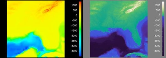
Figure 1. Visualization of the Southeast United States. [4]
Why You Should Consider Perceptually Uniform Colormaps
Before I explain what a perceptually uniform colormap is, let’s start with everyone’s favorite: the rainbow colormap. We all love the rainbow colormap because it’s pretty and is recognizable. Everyone knows “ROY G BIV” so we think of this color progression as intuitive, but in reality (for scalar values) it’s anything but.
Consider the image below, which represents the “Estimated fraction of precipitation lost to evapotranspiration”. This image makes it appear that there’s a very distinct difference in the scalar value right down the center of the United States. Is there really a sudden change in the values right in the middle of the Great Plains? No – this is an artifact of the colormap, which is misleading you!
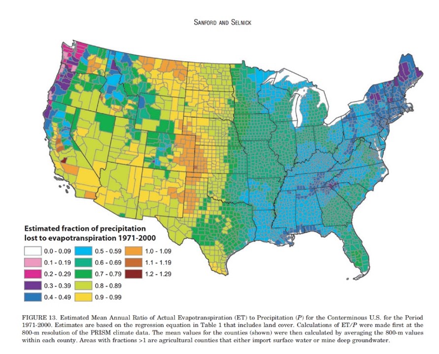
Figure 2. This plot illustrates how the rainbow colormap is misleading, giving the perception that there is a distinct different in the middle of the US, when in fact the values are more continuous. [2]
Comparison of Perceptually Uniform and Rainbow Colormaps
So let’s dive a little deeper into the rainbow colormap and how it compares to perceptually uniform (or perceptually linear) colormaps.
Consider the six images below, what are we looking at? If you were to only look at the top three images, you might get the impression that the scalar value has non-linear changes – while this value (radius) is actually changing linearly. If presented with the rainbow colormap, you’d be forgiven if you didn’t guess that the object is a cone, colored by radius.
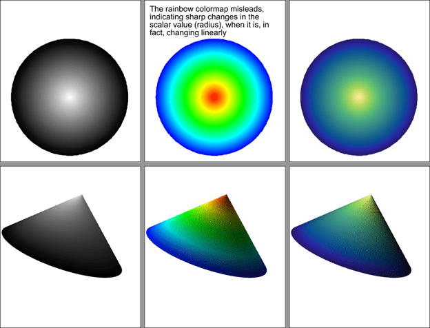
Figure 3. An example of how the rainbow colormap imparts information that does not actually exist in the data.
So why does the rainbow colormap mislead? It’s because the color values are not perceptually uniform. In this image you can see how the perceptual changes in the colormap vary from one end to the other. The gray scale and “cmocean – haline” colormaps shown here are perceptually uniform, while the rainbow colormap adds information that doesn’t actually exist.
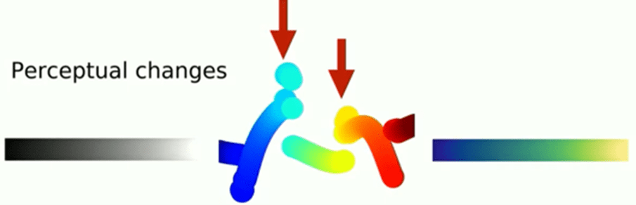
Figure 4. Visualization of the perceptual changes of three colormaps. [5]
So which colormap should I use?
Well, that depends. Tecplot 360 and FieldView are typically used to represent scalar data, so Sequential and Diverging colormaps will probably get used the most – but there are others we will discuss as well.
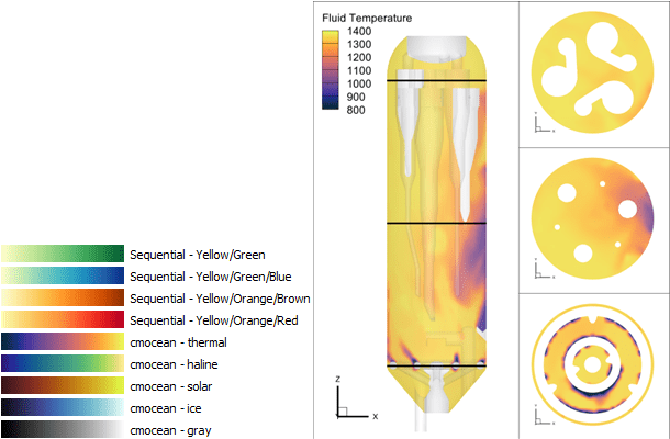
Sequential colormaps
Sequential colormaps are ideal for scalar values in which there’s a continuous range of values. Think pressure, temperature, and velocity magnitude. Here we’re using the ‘cmocean – thermal’ colormap in Tecplot 360 to represent fluid temperature in a Barracuda Virtual Reactor simulation of a cyclone separator.
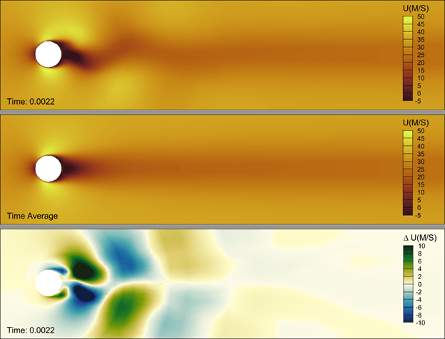
Diverging Colormaps
Diverging colormaps are a great option when you want to highlight a change in values. Think ratios, where the values span from -1 to 1, it can help to highlight the value at zero.
The diverging colormap is also useful for “delta plots” – In the plot below, the bottom frame is showing a delta between the current time step and the time average. Using a diverging colormap, it’s easy to identify where the delta changes from negative to positive.
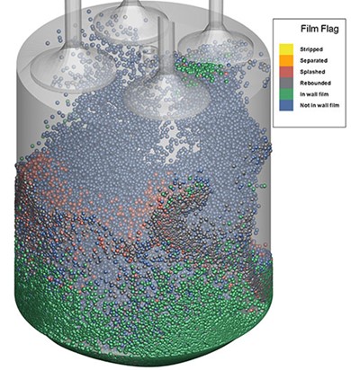
Qualitative Colormaps
If you have discrete data that represent things like material properties – say “rock, sand, water, oil”, these data can be represented using integer values and a qualitative colormap. This type of colormap will do good job in supplying distinct colors for each value. An example of this, from a CONVERGE simulation, can be seen below. Instructions to create this plot can be found in our blog, Creating a Materials Legend in Tecplot 360.
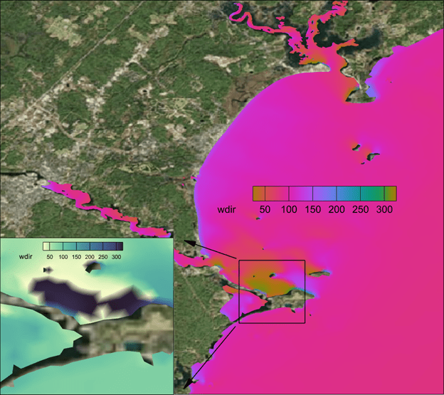
Circular (Phase) Colormaps
Perhaps infrequently used, but still important to point out is the “phase” colormap. This is particularly useful for values which are cyclic – such as a theta value used to represent wind direction in this FVCOM simulation result. If we were to use a simple sequential colormap (inset plot below) you would observe what appears to be a large gradient where the wind direction is 360o vs. 0o. Logically these are the same value and using the “cmocean – phase” colormap allows you communicate the continuous nature of the data.
Purposeful Breaks in the Colormap
There are times when you want to force a break in a continuous colormap. In the image below, the colormap is continuous from green to white ![]() but we want to ensure that values at or below zero are represented as blue – to indicate water. In Tecplot 360 this can be done using the “Override band colors” option, in which we override the first color band to be blue. This makes the plot more realistic and therefore easier to interpret.
but we want to ensure that values at or below zero are represented as blue – to indicate water. In Tecplot 360 this can be done using the “Override band colors” option, in which we override the first color band to be blue. This makes the plot more realistic and therefore easier to interpret.
Best Practices
- Avoid red and green in the same plot. About 1 in 12 men are color blind, with red-green color blindness being the most common [7].
- Use different colormaps for different data and objects. Using colors that are associated with the physical object or property can help make the visualization more intuitive. For example, blue hues for rain and ice, green hues for algae, yellow and orange hues for heat.
- Don’t like our colormaps? Create your own! Tecplot 360 allows you to supply your own custom colormaps as well as change which colormap is default. [1]
References
- https://kb.tecplot.com/2019/12/18/setting-custom-color-maps-as-defaults/
- https://eagereyes.org/basics/rainbow-color-map
- https://pdfs.semanticscholar.org/ee79/2edccb2c88e927c81285344d2d88babfb86f.pdf
- https://flowingdata.com/2008/04/29/why-should-engineers-and-scientists-care-about-color-and-design/
- https://youtu.be/o9KxYxROSgM
- https://www.kennethmoreland.com/color-maps/ColorMapsExpanded.pdf
- https://www.nei.nih.gov/learn-about-eye-health/eye-conditions-and-diseases/color-blindness
- https://medium.com/nightingale/color-in-a-perceptual-uniform-way-1eebd4bf2692