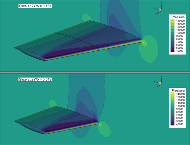
Colormap in Tecplot 360
Which colormap you choose, and which data values are assigned to each color can be vitally important to how you (or your clients) interpret the data being presented. […]

Which colormap you choose, and which data values are assigned to each color can be vitally important to how you (or your clients) interpret the data being presented. […]

In earlier posts we discussed several tips and tricks for making your plots and presentations as effective as possible by tailoring for your audience, using consistent conventions, and avoiding common pitfalls, but what about the flow or narrative of your presentation? […]

When it comes time to present your work to others, it’s important to remember that the purpose of the presentation is clear communication, and the goal is (usually) to make or defend a decision. […]

Whether you have an XY-line or contour plots, styling and formatting is critical in communicating your the results of your analyses. […]

Today we’re going to discuss how to tailor your plots and presentations based on your audience. The key to keeping your audience engaged is delving just deep enough to give context and confidence in your conclusions and recommendations. […]

Consistency in your plots is important because it helps you identify significant differences when comparing datasets or regions of the same dataset. […]